Understanding the Importance of a Donation Button on Your Website
A donation button is a critical component for any organization or individual seeking to raise funds online. Whether you are a nonprofit organization, a political campaign, a community project, or even an individual artist or creator, having a donation button on your website can significantly enhance your ability to collect financial support. This simple feature can transform passive visitors into active supporters, enabling you to further your mission and achieve your goals.
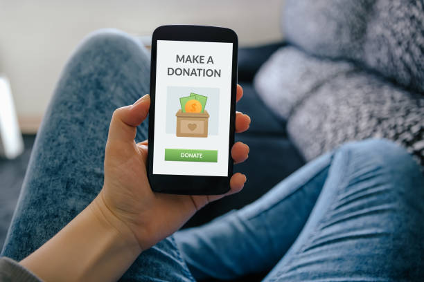
What is a Donation Button?
A donation button is a clickable element on a website that allows visitors to make monetary contributions directly to the site owner or associated cause. It typically integrates with a payment processor to handle the transaction securely. These buttons can be strategically placed on various pages of your website to maximize visibility and engagement.
The Benefits of Having a Donation Button
Increased Fundraising Opportunities
By providing an easy and accessible way for visitors to donate, you increase the likelihood of receiving contributions. The convenience of a donation button means that supporters can contribute at any time, from anywhere, with just a few clicks.
Enhanced Donor Engagement
A donation button can help you engage with your donors more effectively. It can be customized to align with your branding and messaging, creating a seamless experience for your supporters. Additionally, it allows you to collect donor information, which can be used to build relationships and encourage repeat donations.
Streamlined Donation Process
A well-designed donation button simplifies the donation process for both you and your donors. By integrating with a reliable payment processor, you can ensure that donations are processed quickly and securely. This streamlined process can help reduce barriers to giving and encourage more people to donate.
How to Implement a Donation Button
Choose the Right Platform
There are various platforms and payment processors available to integrate a donation button into your website. Popular options include PayPal, Stripe, and dedicated fundraising platforms like Donorbox and GoFundMe. Each platform offers different features, so it's important to choose one that best meets your needs.
Customize Your Donation Button
To maximize the effectiveness of your donation button, customize it to match your website's design and branding. Use colors, fonts, and imagery that resonate with your audience and clearly convey the purpose of the button. A well-designed button can capture attention and encourage more visitors to donate.
Placement Matters
Strategic placement of your donation button can significantly impact its success. Place it in prominent locations such as the homepage, donation page, blog posts, and even within your email campaigns. The more visible the button, the more likely visitors will see it and take action.
Provide Clear and Compelling Reasons to Donate
Alongside your donation button, include compelling reasons why visitors should support your cause. Use stories, statistics, and visuals to illustrate the impact of their contributions. The more emotionally and logically compelling your case, the more likely people will be to donate.
Best Practices for a Successful Donation Button
Make it Mobile-Friendly
With an increasing number of people accessing websites from their mobile devices, it's crucial to ensure that your donation button is mobile-friendly. Test it on various devices and screen sizes to ensure it looks good and functions properly on all platforms.
Offer Multiple Payment Options
Providing multiple payment options can increase the likelihood of receiving donations. Some donors may prefer to use credit cards, while others might opt for PayPal or other digital wallets. Offering a variety of options can cater to different preferences and make the donation process more convenient.
Ensure Security and Transparency
Security is paramount when handling online donations. Choose a payment processor with robust security features to protect donor information. Additionally, be transparent about how the funds will be used. Clearly communicate your mission, goals, and the impact of donations to build trust with your supporters.
Thank Your Donors
Show appreciation to your donors by sending personalized thank-you messages. Acknowledge their contributions and let them know how their donations are making a difference. This not only shows gratitude but also helps build a loyal donor base.
Overcoming Challenges with Donation Buttons
Technical Difficulties
Integrating a donation button can sometimes present technical challenges. Ensure you have the necessary technical support to implement and maintain the button effectively. If you're not tech-savvy, consider hiring a professional to assist with the integration.
Building Trust with Potential Donors
Trust is a critical factor in online donations. Potential donors need to feel confident that their money will be used appropriately and securely. Provide detailed information about your organization, its mission, and how donations will be utilized. Transparency and regular updates can help build and maintain trust.
Encouraging One-Time vs. Recurring Donations
While one-time donations are valuable, recurring donations can provide a more stable and predictable source of income. Encourage supporters to set up recurring donations by offering convenient options and emphasizing the long-term impact of their sustained support.
Case Studies: Successful Use of Donation Buttons
Nonprofit Organizations
Many nonprofit organizations have successfully used donation buttons to raise funds for various causes. For example, Charity: Water uses a donation button on its website to fund clean water projects in developing countries. By providing clear information about their mission and the impact of donations, they have been able to raise millions of dollars.
Political Campaigns
Political campaigns often rely on donation buttons to gather financial support from their constituents. These buttons are typically placed prominently on campaign websites and are accompanied by compelling calls to action that highlight the importance of financial contributions in achieving campaign goals.
Individual Creators and Artists
Individual creators, such as YouTubers, bloggers, and artists, use donation buttons to receive support from their audiences. Platforms like Patreon and Ko-fi offer easy-to-integrate donation buttons that allow fans to contribute directly to their favorite creators, helping them continue producing content.
Future Trends in Online Donations
Cryptocurrency Donations
As cryptocurrencies become more mainstream, some organizations are starting to accept donations in Bitcoin, Ethereum, and other digital currencies. Adding a cryptocurrency donation button can attract tech-savvy donors who prefer to use these alternative payment methods.
Integration with Social Media
Integrating donation buttons with social media platforms can expand your reach and make it easier for supporters to contribute. Facebook, Instagram, and YouTube offer options to add donation buttons to profiles and live streams, providing additional avenues for fundraising.
Enhanced Donor Experience
Future trends in online donations will likely focus on enhancing the donor experience. This could include personalized donation pages, interactive storytelling, and augmented reality features that allow donors to see the impact of their contributions in real-time.
Conclusion
A donation button is a powerful tool for any organization or individual seeking to raise funds online. By making the donation process easy and accessible, you can increase fundraising opportunities, engage with donors more effectively, and achieve your financial goals. Implementing a donation button involves choosing the right platform, customizing the button, strategically placing it on your website, and following best practices to ensure its success. As technology continues to evolve, staying informed about future trends can help you stay ahead and maximize your fundraising potential.